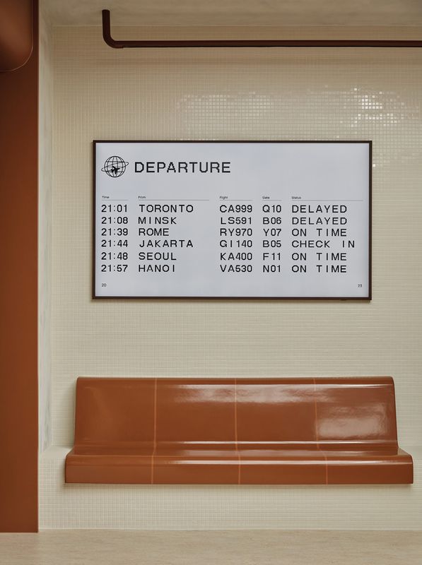
Life in the Antipodes ensures most travellers are well acquainted with the soothingly placeless, timeless design that shapes many transit hubs. Think split-flap display boards, banks of moulded seating, and large-scale architecture that can readily cede focus to the assorted administrative, retail and hospitality interactions that take place within it.
These design cues and the intangible feeling of being on holiday were the starting point for design practice Ewert Leaf’s retail fitout for July, a Melbourne-based specialist in luggage and other travel goods. Founded in 2018, the brand has gained a cult following for its suitcases, thanks to its minimalist design, aerospace-grade polycarbonate shell and hard-working wheels engineered to withstand the cobbled streets of any hilltop Mediterranean village you care to name.

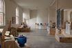
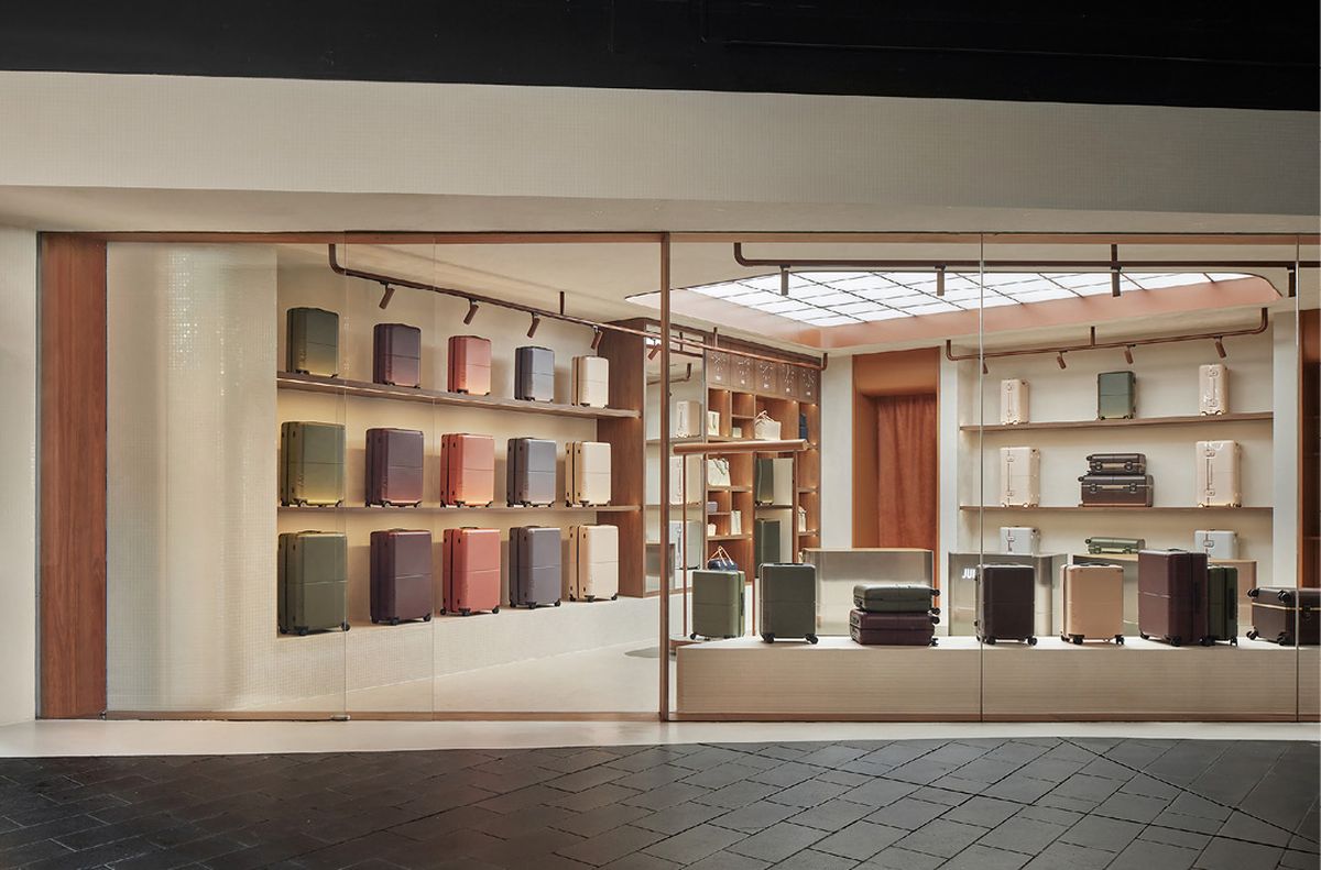
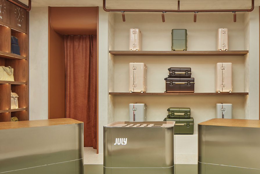
The retail space occupies a trapezoidal ground-floor tenancy at QV in Melbourne’s CBD.
Image: Jack Lovel
“The whole idea of July as a brand is that it’s named for the time of year when everyone escapes for the European summer,” says Ana Calic, director at Ewert Leaf. “They wanted to emulate that feeling of relaxation, of being on holiday, evoking a high-fashion experience while also remaining down-to-earth and approachable.”
The result is a finely tuned retail space characterized by warmth and tactility, located within a trapezoidal tenancy on the ground floor of Melbourne’s QV development. The hard, dark angularity of the surrounding development starkly contrasts with the temperate tones and curving elements that imbue the fitout. Perhaps most surprising, there is no white, grey or black – the usual go-to options for displaying a colourful product range – to be seen here. In their place is a lush palette of cinnamon and timber hues, muted greens and mellow neutrals.

Lessons from previous fitouts informed the client’s requests for the lighting scheme.
Image: Jack Lovel
“The brief was descriptive in terms of the functional requirements, but in terms of how they manifested, it could be any shape, any colour, any material. July advised us not to look at any of their other stores – to consider it a clean slate,” Calic says. The project continued the collaboration between Ewert Leaf and builder Trust Projects, who had worked together on recent hospitality fitouts including Lune Croissanterie and Belles Hot Chicken.
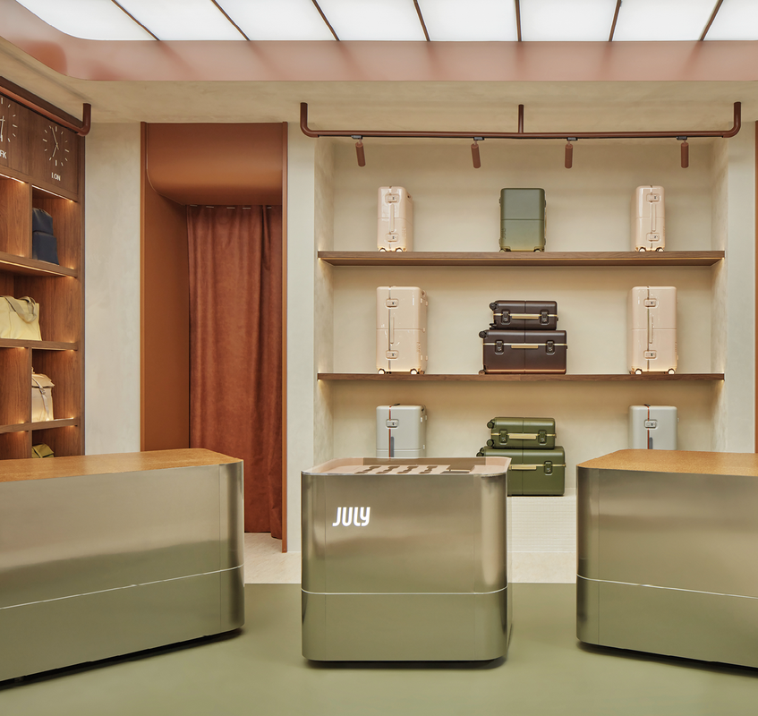
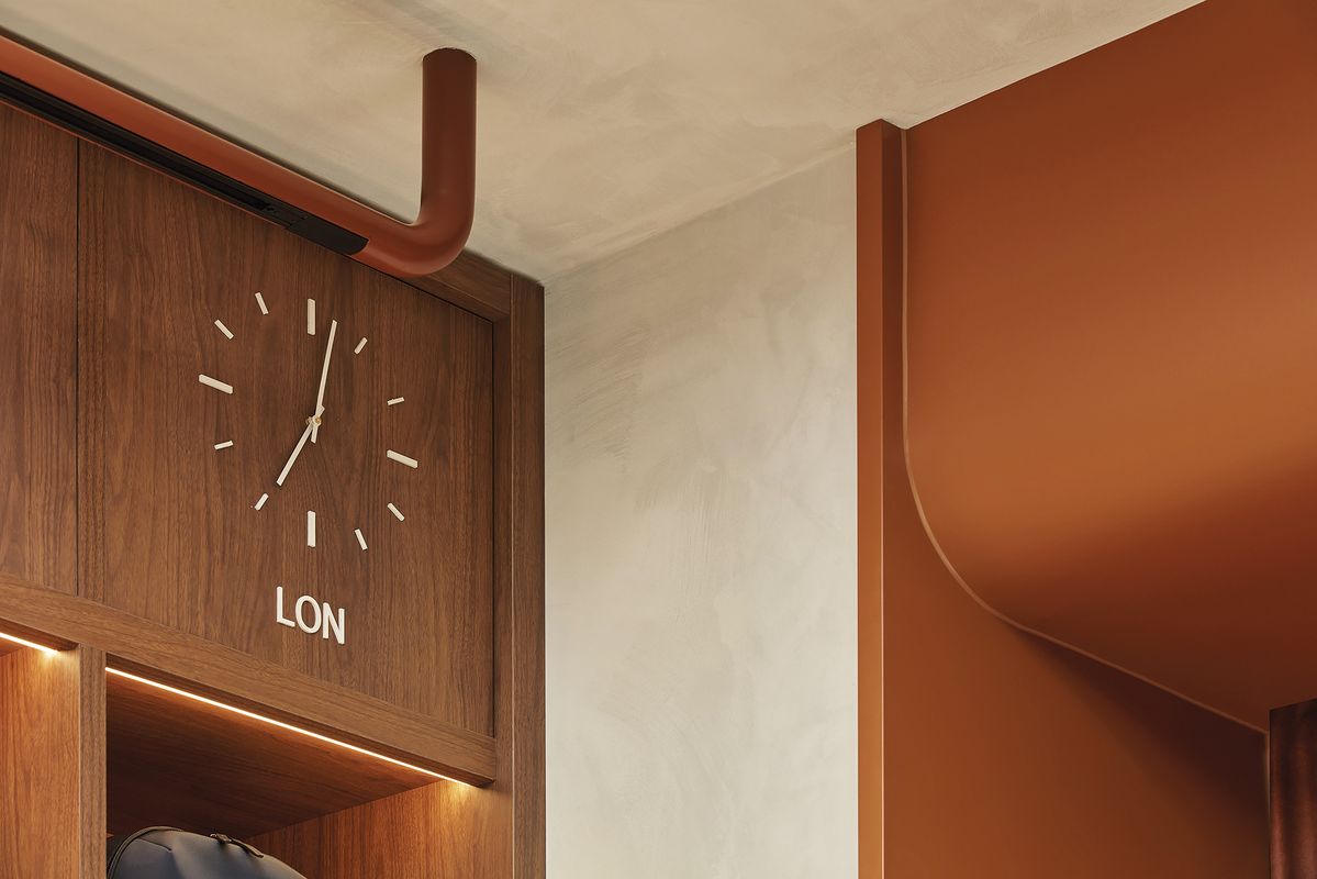
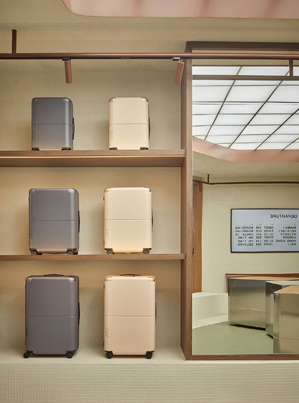
Spatially, the fitout provides a carefully scaled array of joinery elements to show off the merchandise. Timber-fronted shelves and a vinyl-topped plinth along the angled shopfront display suitcases and larger bags, while a joinery unit in the corner presents smaller objects and travel accessories under a bank of world clocks. “Displaying small objects next to larger ones can be quite fiddly, but those adjacencies are important strategically and for the customer experience,” says senior interior designer Tess Carpenter.
Four standalone units float within the main floor: a point-of-sale unit with a transparent top for displaying personalized luggage tags; flanking it, two steel-wrapped counters topped with a soft cork surface; and a moveable display unit that recalls a bellhop’s trolley and has a hanging rail, mirror and product space. Everywhere, rounded corners soften the interior and nod to the sculpted radii of the July product range.

To design a retail fitout that evokes Antipodean holiday travel, Ewert Leaf drew on touchstones like display boards and moulded seats.
Image: Jack Lovel
To stress-test the zoning, the designers mapped out a range of use scenarios – for example, during a sales event, the counter units can be rolled away to open the space. Similarly, when customers are making use of the personalization station in the corner, a bank of moulded seats in a rich cinnamon fibreglass provides a comfortable place to wait.
“We spent a lot of time thinking about materiality. With the layout benches, we had to consider what noise you were going to get when you put the suitcase on the bench and opened it. We picked some cork, which has a beautiful acoustic property and a lovely touch. The same thinking went into the marmoleum floors. We were choosing for tactility, warmth and functionality at the same time,” Carpenter says.
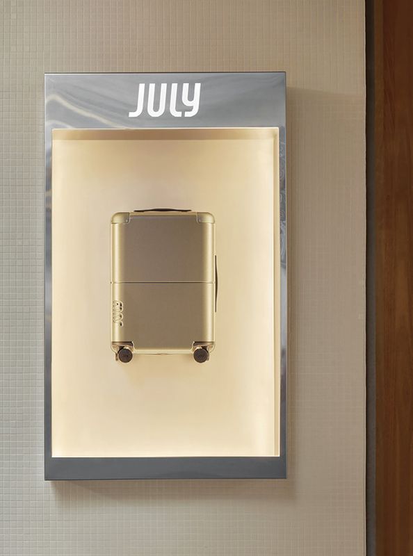
The lighting scheme also plays a critical role in giving the store its character. Lessons from previous fitouts meant the client had very clear direction on what temperature and configuration they wanted. Individual product displays are highlighted by spotlights suspended on rails in the same terracotta hue as the bulkhead. Overhead, a gridded, backlit ceiling evokes the nostalgia of mid-century airport design.

Details like time-zone clocks reference the visual language of transit architecture.
Image: Jack Lovel
“A project like this is not just about commerciality,” says Calic. “If you design an incredible space but the function fails, you have to ask: What’s the point? For us, the question is how you understand the client’s business and create the right environment for those interactions while showcasing a beautiful product.”
Products and materials
- Walls and ceilings
- Internal walls painted in Haymes Artisan in ‘Sandstone Beige’ and ‘Bloom.’ External and internal wall tiles in Cerdomus ‘Antique White’ and RAL Colour gloss mosaic tiles.
- Doors
- Painted 2-pac door frames and curved bulkheads in Dulux ‘Spice Powder.’
- Curtains
- By Mokum from James Dunlop Textiles in ‘Eternal Copper.’
- Flooring
- Forbo’s marmoleum Walton in ‘Rosemary Green’ and marmoleum Real in ‘Rosato.’
- Lighting
- By Sphera.
- Furniture
- Parallel stool by Dowel Jones in Dulux ‘Spice Powder.’
- Joinery
- Cork Pure benchtops by Market Timbers in ‘Light.’ Stainless steel joinery by ABCO Stainless. Upholstered drawer interior by Kvadrat in ‘Waterborn.’ Custom pegboard joinery in Dulux ‘Spice Powder’. Custom Zone vinyl plinth tops by Instyle in ‘Alpine.’ Florentine joinery shelving by Polytec in ‘Woodmatt.’
- Other
- Signage by Good Sign Co.
Credits
- Project
- July QV
- Design practice
- Ewert Leaf
South Melbourne, Melbourne, Vic, Australia
- Project Team
- Ana Calic, Tess Carpenter
- Consultants
-
Builder
Trust Projects
- Aboriginal Nation
- Wurundjeri Woi-wurrung and Bunurong Boon Wurrung peoples of the Eastern Kulin nation.
- Site Details
- Project Details
-
Status
Built
Design, documentation 2 months
Construction 1 months
Category Commercial
Type Refurbishment, Retail
Source
Project
Published online: 28 Feb 2024
Words:
Peter Davies
Images:
Jack Lovel
Issue
Artichoke, September 2023