In its first purpose-built embassy building in the United States (1965–69), Australia was presented through a white prism, demonstrating a mastery of international rationalism. The young federation adopted a “palazzo-like” monumentality – a civic modernism, chisel-clad in Tennessee marble.1 National calling provokes self-consciousness. As well as giving Bates Smart its mid-century name, principal designer Osborn McCutcheon, along with Hubert Banahan, also exercised the firm’s capacity to combine technical expertise with “material tactility and fine art.” This competence remains evident in the firm’s second Washington chancery, as do certain of the architect’s mid-century tropes – such as featured furniture designs and commissioned artworks, the “textural celebration of surface,” and the interior use of borrowed landscape.2 Evolving continuity is the fundamental strength of Bates Smart. The abstract, totemic bronze emblem designed by Tom Bass for the first building still announces the cultural mission, while the symmetry, bronze trim and timbered assembly hall of the earlier work are reinterpreted. But the white modernist vision has receded. Australia now offers a more complex and tangible reality – not a conceptually defined mass, but an intricate coherence of colours, textures and constituencies.
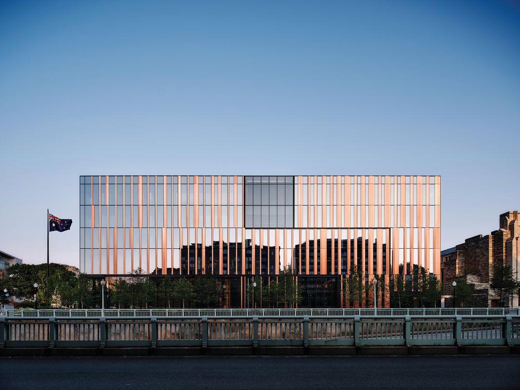
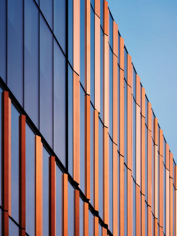
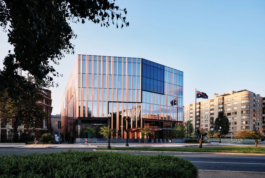
Although the architects describe their new embassy as a “monolithic form … inspired by Australia’s iconic landscape,”3 the building is difficult to grasp at a distance. Certainly, the glazing and black frame of its curtain wall subtly figure against the sky. The tint of the glass darkens reflections of the surroundings. Like the glass, the tone of the interleaved copper panels varies with the light; but the copper – treated to stabilize its oxidation – stands out more strongly. Folded in counter-relief to the glazing, the panels project slightly. Moreover, their continuity through the height of the enclosure gives them prominence over the horizontal datums and rhythmic syncopations of the surface. Rather than a monolith, the exterior evokes the vertically striated, multi-scalar textures of a eucalypt forest. This prefigures the interior. For as the building is approached, and the reflections of the context disappear, the predominantly transparent, black-and-ochre enclosure reveals a richly textured, light-filled interior. And yet, as the ambiguous depth extends into the building and the striations are laid at various scales into its coverings, furnishings and operable screens, this haptic visual encounter unfolds into an urbane mood. In its trans- verse direction, the new Australian embassy is a fluctuating relief of space, material, colour and light. In its longitudinal axis, it is a vertical urban room continuous with the city.

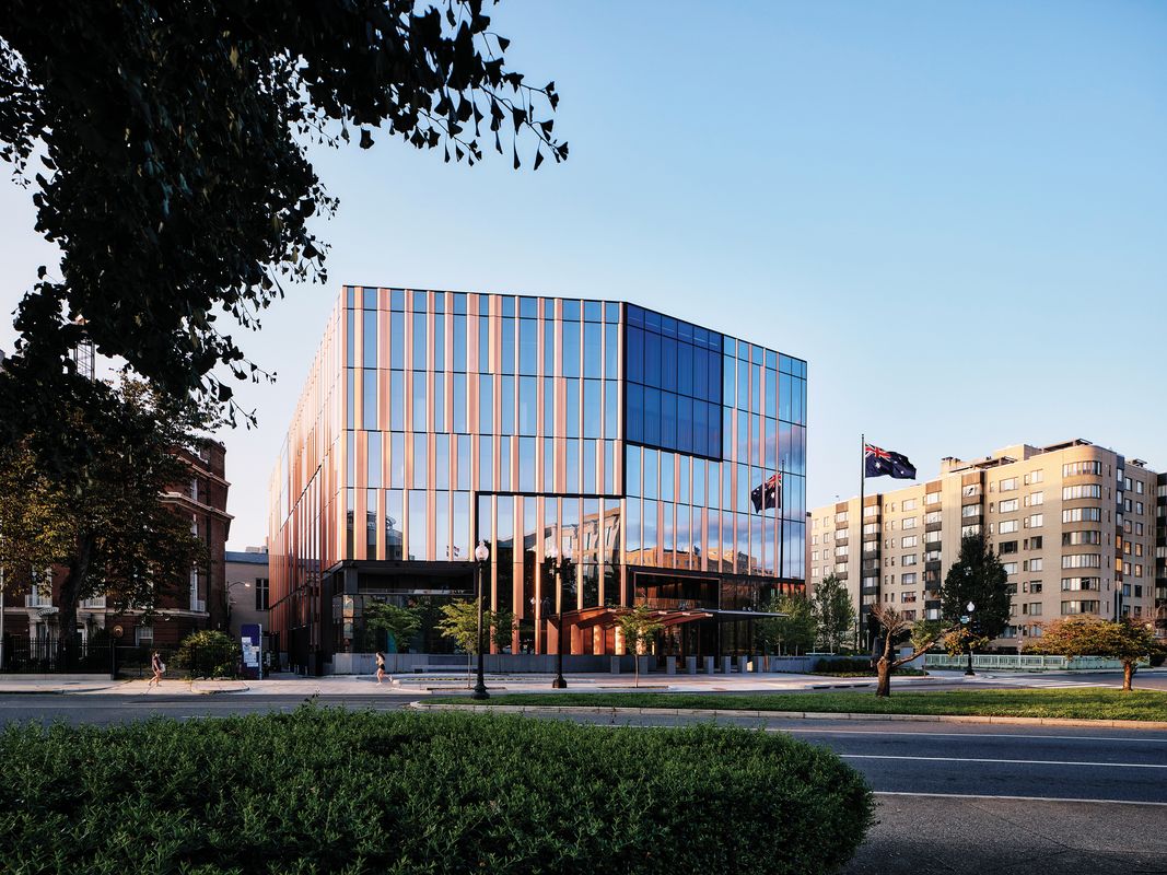
The public can walk right up to the embassy building, which is surrounded by vegetation and “galleries” used to display sculpture, on all sides.
Image: Joe Fletcher
This interleaving of landscape and urban aesthetics is an accomplishment. Landscape abstraction has become a reflex of Australian architects. But it is not characteristic of Bates Smart, which has written the index of the country’s architecture for 170 years.4 The indication here: contemporary Australian practice has a sophistication that iconic jingoism – which can still influence a competition – belies. That sense reflects the predominantly commercial work of Bates Smart’s offices in Sydney and Melbourne – cities that, relative to many global centres, have a density and public commitment that demands innovative, refined design. Solutions developed in these contexts contribute to the remarkable openness, vertical urbanity and spatial interlacing of the new chancery; the architect crafts the urban edge of the building, opens its internal spaces to the city, and hollows its core with atria and programmed circulation.
Unlike the old building, the new chancery holds the street, folding its entry-elevation, respectfully comporting with the determined height and Beaux-Arts plan of Washington. It fronts Scott Circle, on axis with the White House. For light, views and floorspace, the design takes advantage of the circle, the generous widths of Massachusetts Avenue and Sixteenth Street, the setbacks of the church to the north, and the bollarded laneways internal to the block.
On all sides, the public can walk right up to the building. A mix of local and antipodean vegetation conceals a low, granite-clad wall, providing security without isolating the embassy, opening views into and from the interior at ground level, and ensconcing a series of exterior spaces (one sunken). These “galleries,” used for the display of sculpture at street level, are accessible to passing pedestrians and provide a landscaped backdrop to the interior, foregrounding the city beyond.

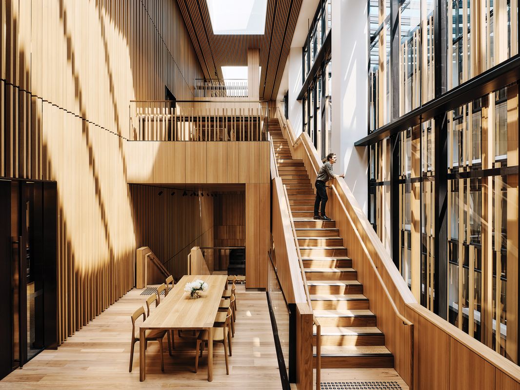
In between meeting rooms, staff kitchens and lounges, an open stairway integrates the upper floors of the building.
Image: Joe Fletcher
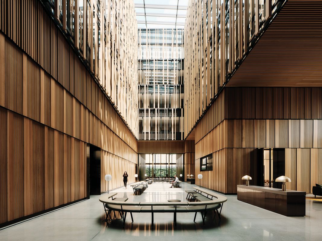
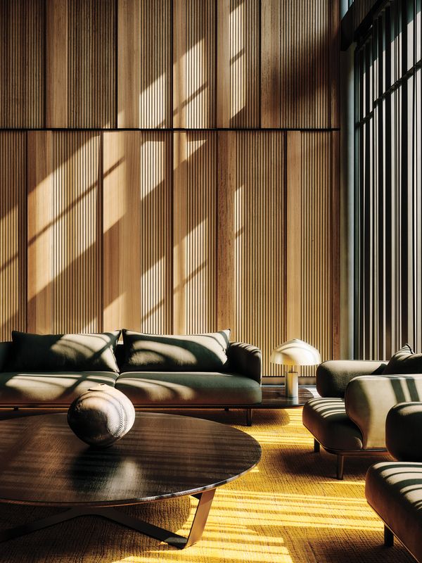
What Bates Smart calls the “civic axis”5 extends from the entry portico through the building to an exterior vertical garden and the stained-glass and stone of the church wall to the north. Visitors to the major public spaces of the building only briefly diverge from this axis for security procedures. They return to it through a small waiting area that is transversely aligned with a gallery of Australian art that opens to both the central axis and the exterior. With its ivory-coloured limestone, Robin Boyd-inspired sofas, and black-and-white photographs and rug, the waiting lounge, which also serves the elevators and consular facilities in the underground storey, preserves a sense of the 1960s building; its chiaroscuro is a foil to the interplay of colours, textures and light in the central space. That light comes from all directions – but principally, in its central three bays, from large skylights six storeys above ground. Direct sunlight drapes across the Australian blackbutt-lined walls of this large room. In the lower level of the space, layers of the timber, warmly lit by artificial sources, variously alternate in rhythm and width to provide a visual and acoustic backdrop that also conceals the storage and servery spaces requisite for gatherings. In the atrium above, battens of the wood give texture to a black curtain wall that screens, while offering light and interior views to, the upper floors. This golden, bronze-trimmed public space, incorporating meeting areas and lounges, has multiple foci: brown and olive furnishings, orange and bone rugs, wall-hangings, paintings, and suspended and standing sculptures. Although it includes an auditorium, isolatable using large pivot doors, the timbered walls and polished-concrete floor unify a multifaceted space suitable for both intimate meetings and large events.

The “civic axis” extends from the entry portico through the centre of the building.
Image: Joe Fletcher
Parallel and visible to, but secured and screened from, the atrium of this “civic space,” an open stairway, intermixed with meeting rooms, staff kitchens and lounges, integrates the upper floors of the building and the representatives of the embassy’s various government departments.6 A common strategy in contemporary, high-end office buildings, this programmed circulation extends into a large social space and two external balconies that can also be used for informal meetings between embassy staff and visitors. Top-lit and clad in blackbutt like the central public space, this vertical social condenser constitutes a neutral threshold between the black exterior and the white interiors of the workspaces. With the core and the atrium, it transforms the substantial volume of the building into U-shaped floorplates, planned for individual offices around the atrium and open-plan workspaces or meeting rooms at the periphery.
Although Bates Smart has largely applied and updated extant tropes, rather than seeking a new idiom (as the architects of recent Australian embassies in Bangkok and Jakarta have done), its latest chancery gives new meaning to the permanence of public architecture. The building’s landscape security strategy, energy-efficient curtain wall, rooftop solar array, naturally lit interior, malleable public spaces, flexible office floors and relaxed staff amenities advance the type – even if its “lobby” and workspaces, and especially its curtain wall (a relatively muted enclosure, not an iconic form), can appear corporate.7 The security, solidity and aesthetic of the firm’s first embassy withered with age. Its emphatic claims are absent in the second, but the “Featurism” Boyd once critically associated with the firm has become convincing; the new Australian embassy is a sophisticated layering of space, material, landscape, furnishings and art.8 Those expecting the iconic, or judging from a distance, may not recognize that this is a compelling representation of the country and its architecture.
- Philip Goad, Bates Smart: 150 Years of Australian Architecture (Fishermans Bend: Thames and Hudson, 2004), 203.
- Goad, Bates Smart (2004), 158–62.
- Bates Smart, “Australian Embassy, Washington D.C.,” press pack (2023), 6.
- Goad, Bates Smart (2004), 11.
- Bates Smart, “Australian Embassy” (2023), 6.
- Bates Smart, “Australian Embassy” (2023), 3.
- In situ, the suppressed floorplates, by comparison with the surrounding masonry buildings, reduce the scale of the building.
- Robin Boyd, The Australian Ugliness (Melbourne: F. W. Cheshire, 1960), 218–21.
Credits
- Project
- Australian Embassy in Washington, D.C.
- Architect
- Bates Smart
Australia
- Project Team
- Simon Swaney, Kristen Whittle, Mark Healey, Steve Jones, Timothy Leslie, Cian Davis, Ray Feile, Eamon Harrington, Brendan Grayson, Rachael McCarthy, Amy Banfield, Ali Bolandnazar, Raymond Butt, Lai Yee Chan, Leo Chen, Wai Fong Chin, Joel Collins,, Mark Di Bartolo, Christian Grossi, Gabrielle Hamilton, Richard Healy, Celine Herbiet, Jackson Hexin Bi, Henry Howson, Allan Lamb, Erica Lienert, Brian Mason, Andrada Olteanu, Carli Popplewell, Ian Potter, Samantha Poole, Chris Prince,, Jefferson Protomartir, Emma Serraglio, Caroline Surgiato, Christopher White, Deirdre Whitnall, Emma Wingad
- Interior designer
- Bates Smart
Australia
- Consultants
-
AV, security and communications consultant
Aurecon, Interface
Architect of Record KCCT
Civil consultant Aurecon, Sorba Engineering
Cost consultant Rider Levett Bucknall
DDA and OHS consultant du Chateau Chun
Developer DFAT Overseas Property Office
Electrical, fire, mechanical and hydraulic engineer Aurecon, Interface
Fire engineering, acoustic and ESD consultant Aurecon, Arup
General contractor Clark Construction
Kitchen consultant Eatscape (formerly Chris Love Design), Culinary Advisors
Landscape consultant TCL, Wiles Mensch
Lighting consultant Electrolight, One Source Lighting and Design
Project manager Jacobs
Signage Ongarato
Structural and facade engineer Aurecon, SGH
Traffic consultant Wells and Associates
Vertical transport consultant Aurecon, Interface
Zoning and land use Holland and Knight
- Site Details
-
Site type
Urban
- Project Details
-
Status
Built
Category Interiors
Type Workplace
Source
Project
Published online: 15 Mar 2024
Words:
Scott Colman
Images:
Joe Fletcher
Issue
Architecture Australia, March 2024